

Web design is constantly renewing itself in order to create more practical, more intuitive web pages and above all to generate more conversions.
Here are 3 web design trends not to be missed in 2023 for irresistible pages.
1) Age-responsive design
You are certainly familiar with responsive design, which consists of making a website perfectly readable and fluid on any medium.
Now is the time to discover age-responsive design.
What is it about? A website design that adapts according to the age of the user: an idea that may seem absurd, and yet could not be more serious.
Indeed, age-responsive design is based on the following principle: the different age groups do not all react in the same way to a given type of content, just as they do not have the same sensitivities in terms of colors and aesthetics.
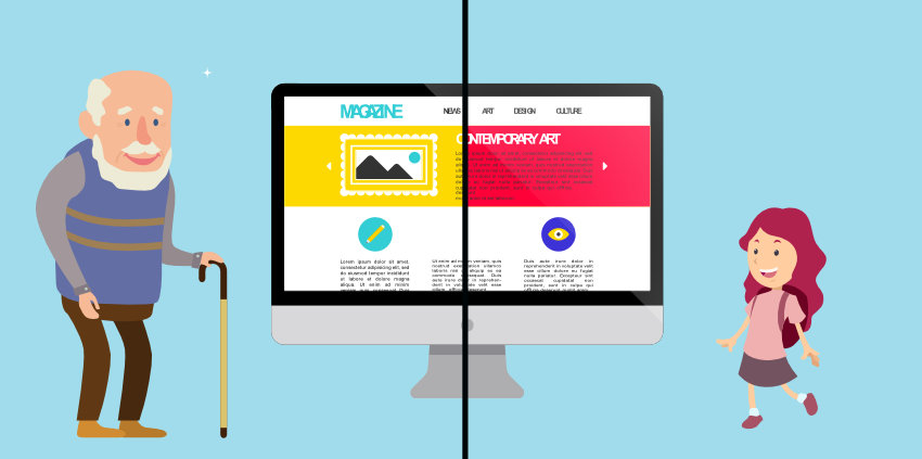
The idea is therefore to offer each of them a suitable design, all on a single website. Age-responsive web design would therefore impact.
The fonts used and their size (the texts would, for example, be larger and more readable for the elderly);
The content available (children would not have access to certain unsuitable ones, for example);
The navigation menus (more or less complete depending on the level of knowledge of the user);
The color palettes used...
The objective: is to offer each user a personalized (and therefore more pleasant) experience on the site and boost conversions.
This is all well and good, but how exactly does it work? You may have guessed it: the answer is in big data.
All navigational data collected on the web (by Google, Facebook, and many others) can be used to estimate the age of any user (in addition to many other characteristics).
By exploiting this information and in particular the estimated age, the site is able to adapt to the user for an optimal user experience.
For now, age-responsive design is still quite theoretical, but it could well be one of the major web design trends to come.
2) Cinemagraphs
If you've never heard the term "cinemagrapher" before, we could sum it up simply by saying that it's a hybrid between a GIF and a classic photo.
And if that's not telling enough, here's a concrete example:

You see, in cinemagraphs, only a small portion of the image is moving, the rest being completely still.
What application for web design, you ask?
Well, cinemagraphs are particularly a rising value in the design of home pages:

Why use cinemagraph rather than video?
Generally speaking, we know that the human eye loves movement, hence the widespread use of video in web design to captivate visitors and keep them on the site.
However, the video has a major drawback: its weight, which quickly slows down the page. And compression is only a half solution since it largely affects the video quality.
The cinemagraph, for its part, has a much more reasonable weight.
Why use the cinemagraph rather than the GIF?
Firstly because cinemagraphs have (for the moment) an enormous asset: surprise. Half still, half moving, these unusual images are sure to intrigue and capture attention.
Moreover, if the GIF is making a strong comeback and is easy to create, it is still more or less perceived as kitsch, even in an old-fashioned format.
The cinemagraph comes precisely to refresh and renew the small world of the GIF.
3) Skeleton screens
The loading speed of a page is a fundamental element in the appreciation of the user experience, in addition to being an important SEO Ranking factor.
But, short of being really fast, loading a page absolutely has to look fast.
To make the user wait less, different solutions are traditionally used, in particular, loading bars when the precise loading time is known.
You can also use visual indicators (“spinners”) when the loading time is unknown. Skeleton screens (literally “skeleton screens”) are another way of managing the loading of a page, consisting of first displaying the foundations of the page (the “skeleton”) and then displaying new elements gradually.
This is for example what Facebook does:
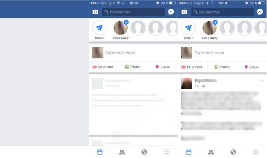
As we can see, the elements appear gradually, and the page becomes more and more detailed.
The application thus reveals its “contours” and gives an overview of what is to come (like a kind of trailer), reducing the waiting time felt.
This, therefore, decreases the bounce rate on your pages, increasing your conversion rate at the same time.
Do these 3 original Webdesign trends inspire you for your website? But you don't know if these changes can fit into your budget? Then try our price simulator for web design now.
Don't wait any longer to find a web designer or estimate the price of a web design.